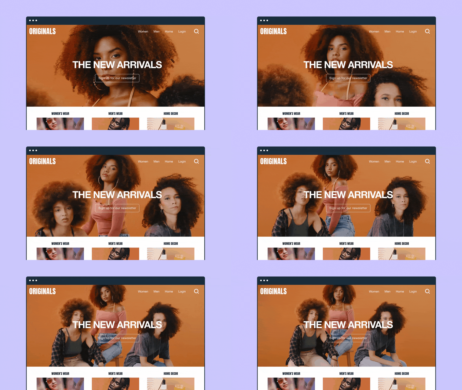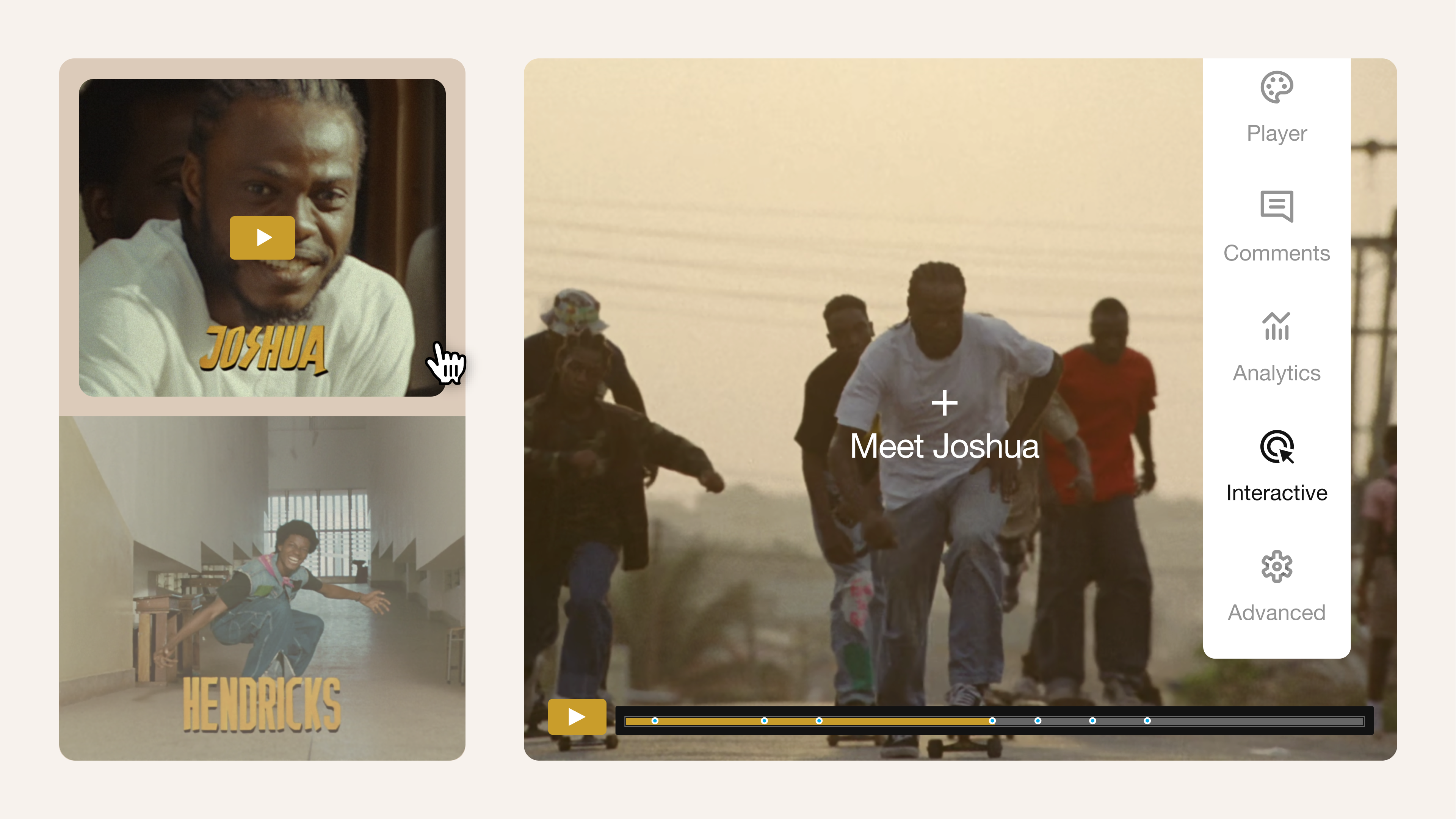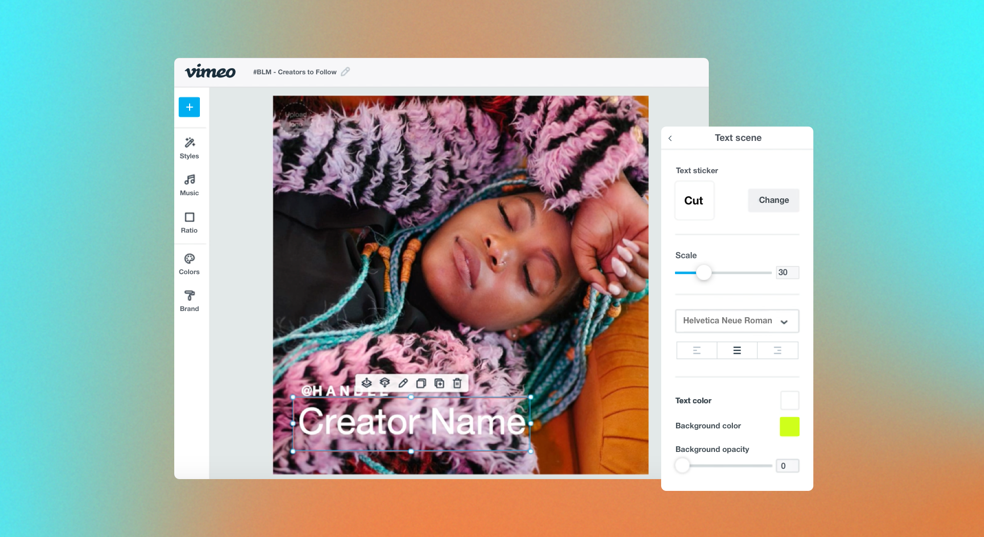
While a video plays, lower thirds elements can take over the little-used bottom part of the screen to share useful information or enhance the primary content. Well-designed lower thirds show that time and effort went into the editing process, giving your video a more professional and engaging feel.
Lower thirds have many uses, and you’ve probably seen them in action many times — from the crawls under news reports to the closed captions for live streams. This article will explain what makes lower thirds so useful and show you how to design them in Vimeo.
What are lower thirds in video production?
When designers refer to lower thirds, they mean the overlays that sometimes take up the lower third of the screen during video replay. Lower thirds let you add more to a video without obscuring anything important or detracting too much from the main content.
Sometimes these elements are subtle, with dim or transparent backgrounds to avoid distracting viewers. Others are animated or feature attention-grabbing visuals and are designed to call viewers to action.
Lower thirds can be used for just about anything, but here are four common functions:
- Identify speakers: During interviews, live events, or documentaries, lower thirds can include brief animated visuals that identify speakers and their roles or qualifications.
- Display information: You can break your video into chapters signaled by large text in the lower thirds, or visually present key details so they’re more memorable to viewers.
- Reinforce branding: Lower thirds are a great place to show off your logo, or invite viewers to “like and subscribe” with animated visuals that match your branding.
- Enhance accessibility: To help viewers with language or hearing challenges, you can use lower thirds for translations, captions, or subtitles in a readable font.
Lower thirds graphics design: Best practices and examples
Lower thirds graphics and text must be carefully designed to add to the viewing experience rather than detract from it. Here are some best practices and examples that demonstrate how to do that.
Key design principles
Follow these design principles when designing lower thirds for videos:
- Keep text concise: For subtitles and captions, use only a small portion of the screen, with no more than three lines showing at a time. Chapter titles and speaker labels should only require one line, so you can maximize their font sizes.
- Use brand-aligned fonts and colors: Keep the viewing experience consistent by using cohesive brand assets that share the same color palette, typography, graphics, and overall style.
- Prioritize readability: Use contrasting colors or drop shadows to keep lower thirds text readable no matter what’s on the screen behind it, and pick monospaced, sans serif typography that’s easy to read.
- Follow safe zone margins: Place all lower thirds elements within a designated box, and make sure that the box has interior margins that prevent text and visuals from being cut off.
- Add visual interest: Include subtle transitions and animations that briefly draw viewers’ attention without derailing the experience. It takes some experimentation to get the timing just right, but using a lower thirds template gives you a head start.
Lower thirds examples for creative inspiration
Over at the Lower Thirds Templates Vimeo channel, you’ll find eight examples of animated lower thirds graphics. Most are already styled, but you can easily modify these starting points with your own branding and visuals thanks to Vimeo’s text-based and timeline editors.
Whether you use these templates directly or just for inspiration, pay attention to their:
- Timing: Overlays should last long enough to get the message across without forcing viewers to speed-read, but not overstay their welcome.
- Color: Examine how each example combines colors to create a visually appealing look, and experiment with your own color palette to achieve similar results.
- Typography: Notice when these examples use larger display fonts versus simpler, more readable text, and consider when each choice is most appropriate.
How to create lower thirds with Vimeo
Vimeo helps you with every aspect of video design, whether you’re creating static videos, streams, virtual events, or live broadcasts. Here’s how to add lower thirds elements.
Design attention-grabbing lower thirds with Vimeo →
Adding lower thirds to live streams
To add a lower thirds overlay to a live stream on Vimeo Streaming:
- In Vimeo Live Studio, open the “Graphics” panel and click on “+ Add lower third.”
- Upload an image, and enter the text you want displayed.
- Open the “Scene” tab in the “Graphics” panel, and select the “+” icon next to the lower thirds element you want to add.
- Go to the “Overlays” list at the top of the player and select “Show lower thirds.”
Adding lower thirds to recorded videos
To add lower thirds to existing content using Vimeo’s browser-based video editor:
- Open the video, and visit the “Editing” tab to select “Video editor.”
- Choose the “Graphics” tab, and use the dropdown menu to select a relevant category. For example, if you’re making a speaker label, check out “Shapes and Frames” to find a good starting point.
- Use the buttons above the preview window to adjust your starting graphic’s colors and orientation, then drag its thumbnail in the timeline editor to change when it appears and for how long.
- Open the “Text” tab and click on “+ Add Text” to insert a text box, then use the editing tools to make sure it matches your graphic.
- Select each element of your lower thirds and choose “Animate” to select an animation. For your first lower thirds experiment, you may want to use the same animation style everywhere to avoid distracting viewers with too much movement.
- When you’re satisfied with your lower thirds designs, “Save” your work and head back to your Vimeo dashboard for download and sharing options.
FAQ
What size should a lower thirds graphic be?
The best size for lower thirds graphics depends on what you’re making, but here are a few suggestions for a 1080p resolution video:
- Subtitles and closed captions: 1,280 x 240
- Chapter titles: 1,280 x 480
- Speaker labels: 960 x 240
- Calls to action: 480 x 480
What are the five elements of lower thirds?
The five main elements in effective lower thirds graphics are typography, color palette, graphics, animations, and layout. Each should be designed to convey information or reinforce your branding without distracting too much from the video.
How do you make a lower thirds animation?
The easiest way to create lower thirds animations is to use a video editing platform that has lots of tools and options. With Vimeo, you can animate your lower thirds overlays, then customize their effects, directions, styles, and timing.
Create professional lower thirds with Vimeo
Lower thirds add a professional polish to all kinds of videos, and offer viewers extra information or easy ways to take action. It’s best to start simple to avoid distracting viewers, and include concise text and visuals that are aligned with your branding.
You’ll also need one more component — a platform that makes lower thirds design quick and easy. With Vimeo’s browser-based editor and large library of assets, you can build visually impressive lower thirds graphics complete with text, logos, images, and animations. Plus, live graphic overlays and timeline editing help you enhance any type of video content, from live streams to virtual events.
